Zan wallet
Wallet for a simpler life.
I couldn’t find a wallet that fitted my personal style. I wanted one that was slim and stealthy while at the same time, holds all the essentials of city trotting and finally, one that doesn’t hurt my thigh. Yes, it’s a personal peeve of mine. Big bulky stuff in my pockets gave me athritis-like pain in my thigh muscle. So with those in mind, I went out and searched for one to buy, unfortunately, none of them fit the criteria. For most of the society, a bulky wallet is a display of wealth, so I am pretty much screwed in that regards. Then I thought to myself :”Hey, I don’t care about that, all I care about is my own comfort.” So as a result, Zan wallet version 1 is born.
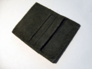
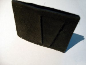
Zan wallet V1
The focus of the wallet is in the credit card slots that are part of the two piece of leather that holds the money. It gave me easy access to the most used 4 cards that I need and stores a few bills for those instances when you can’t pay with plastic. The cards pinches against the cash inside the wallet so as long as pressure is present (aka inside your pocket) the money bills will be held together by the cards a very convenient accident if you ask me. Also, the staggered way that the card slots are built, allows the wallet to bend to the shape of my thing. It surprised me when I realize that I can’t feel whether I have a wallet in my pocket or not. The downside of the design is that you have to fold your bills like a money clip. Since I touch actual cash about once every month, that is an acceptable inconvenience for me.
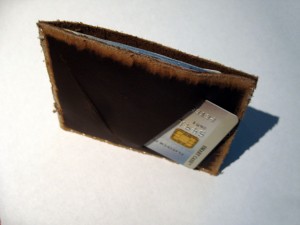
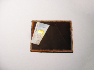
Zan wallet V2 now 2% more spacious
The thread in the first test version broke after 4 months of testing, I continued using it for 2 more months because for one reason or the other, one break did not bring about the complete collapse of the wallet. V1 was also a test version to see which type of card slots would work best so V2 is designed for actual continued use than V1.The build is better, the threading is better. I did away with the Suede exterior and opted for the traditional leather skin. I thought suede would give my wallet that expensive look it needed, but suede + wear and tear makes for some ugly leather.
To make it feel thinner while at the same time allowing me to suture closer to the edge, I decided to finish the edges with an angle to thin out the leather. Sort of like what apple did with their iPad original. As a surprising side effect, it created a lighter colored frame that gave it an aged look. A beautiful accident that I decided to keep and use on all four sides.


Leave a Reply